Sana Sans Family
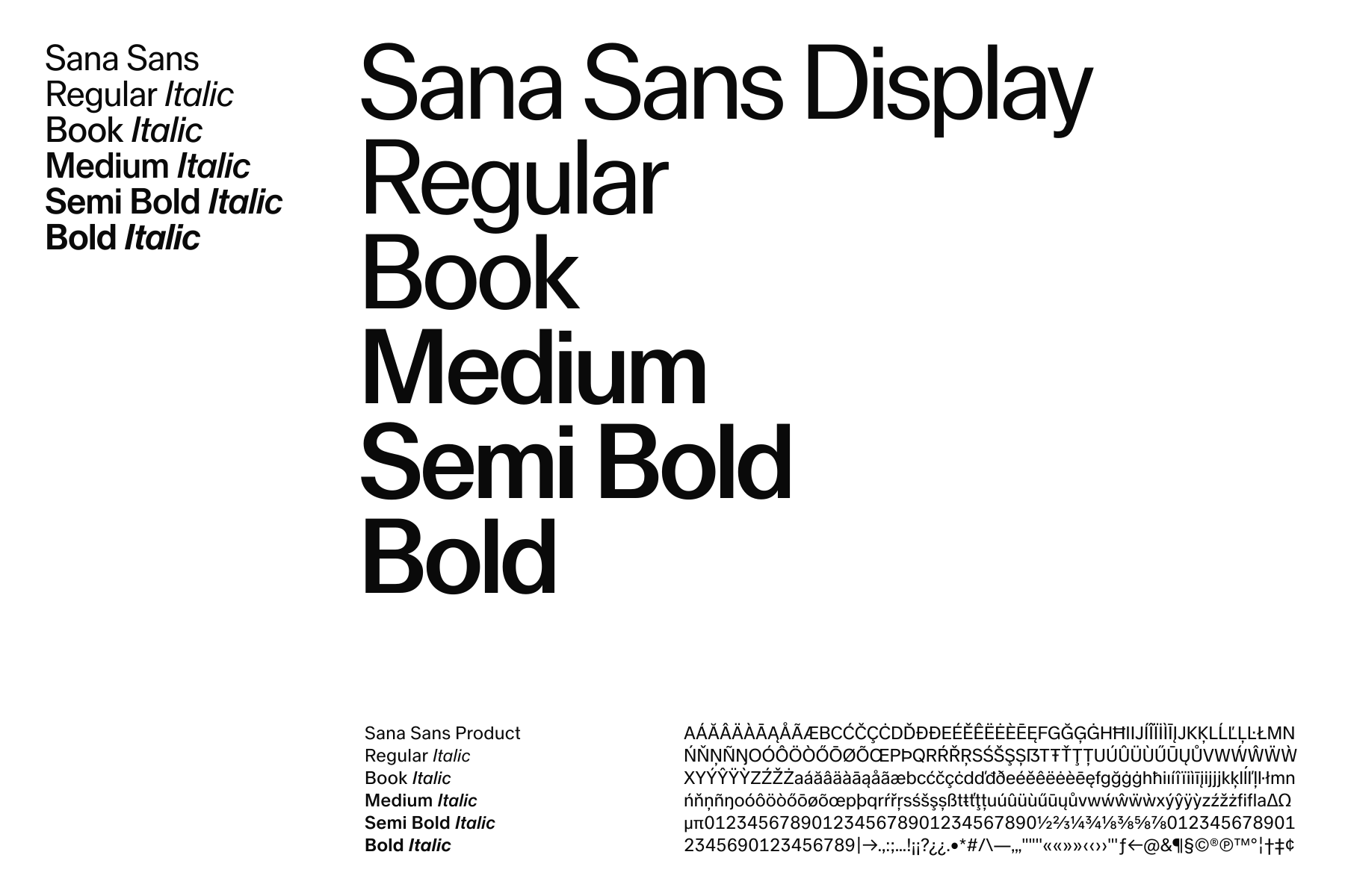
Sana Sans is our typeface, used across every part of the Sana identity. The family is designed to adapt to different scales and contexts while maintaining a consistent typographic expression.
Sana Sans Display is used for headlines and large-scale typography. Sana Sans is used for body copy and medium-sized text. Sana Sans Product is optimized for product and UI applications.
Together, they form a flexible and consistent typographic system across brand, communication, and product.
- Sana Sans Family
Downloads
Usage
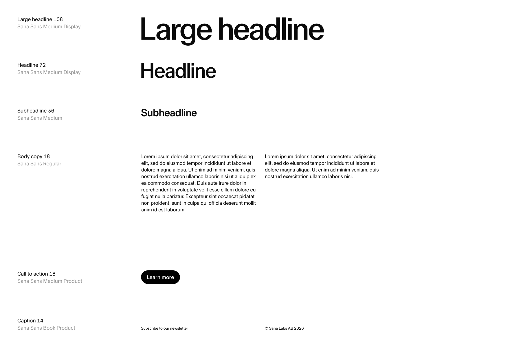
Our typographic system is built around a small set of primary styles. Sana Sans Medium Display is our default for headlines, Sana Sans Medium for subheadlines, and Sana Sans Regular for body copy. Sana Sans Product is reserved for functional elements such as calls to action, captions, and UI.
These styles should be the starting point across most brand applications. Other weights and sizes can be used when needed, but the primary styles shown here should define the overall typographic expression.
Type fundamentals
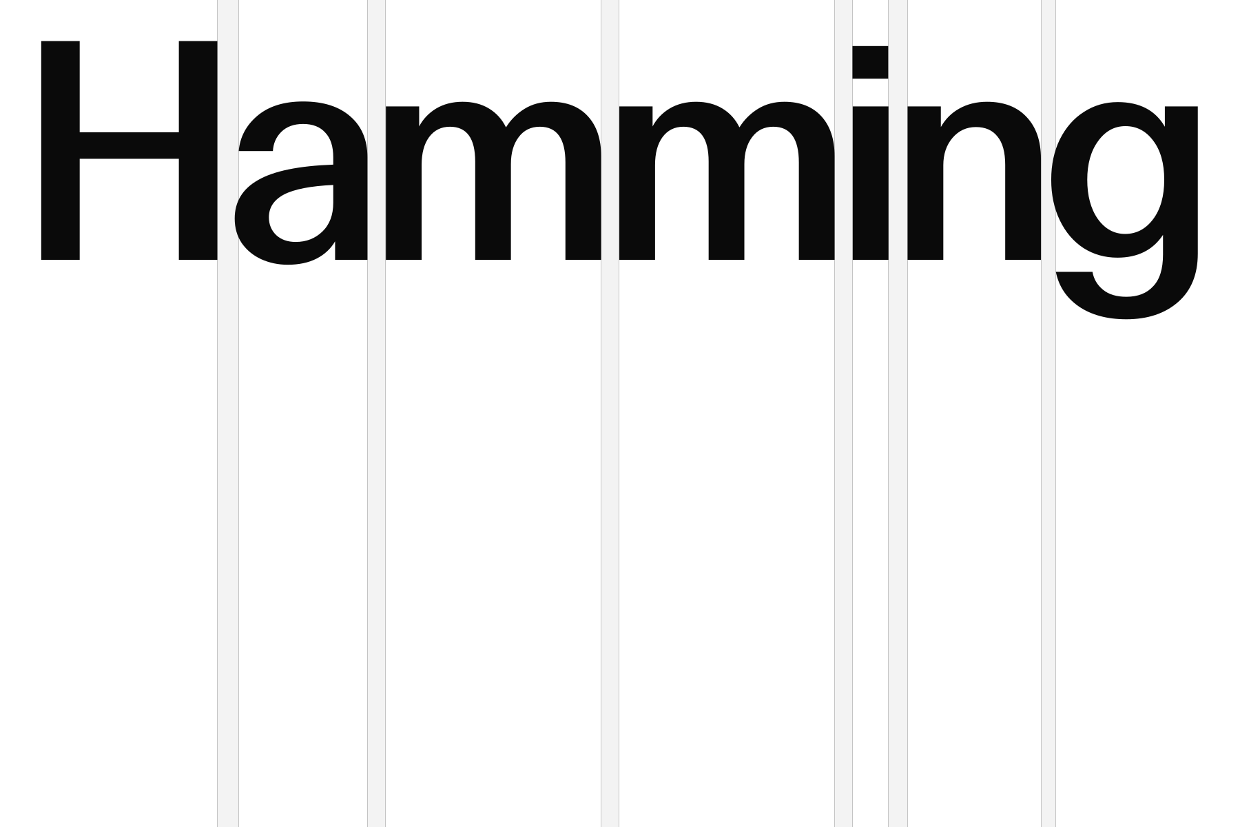
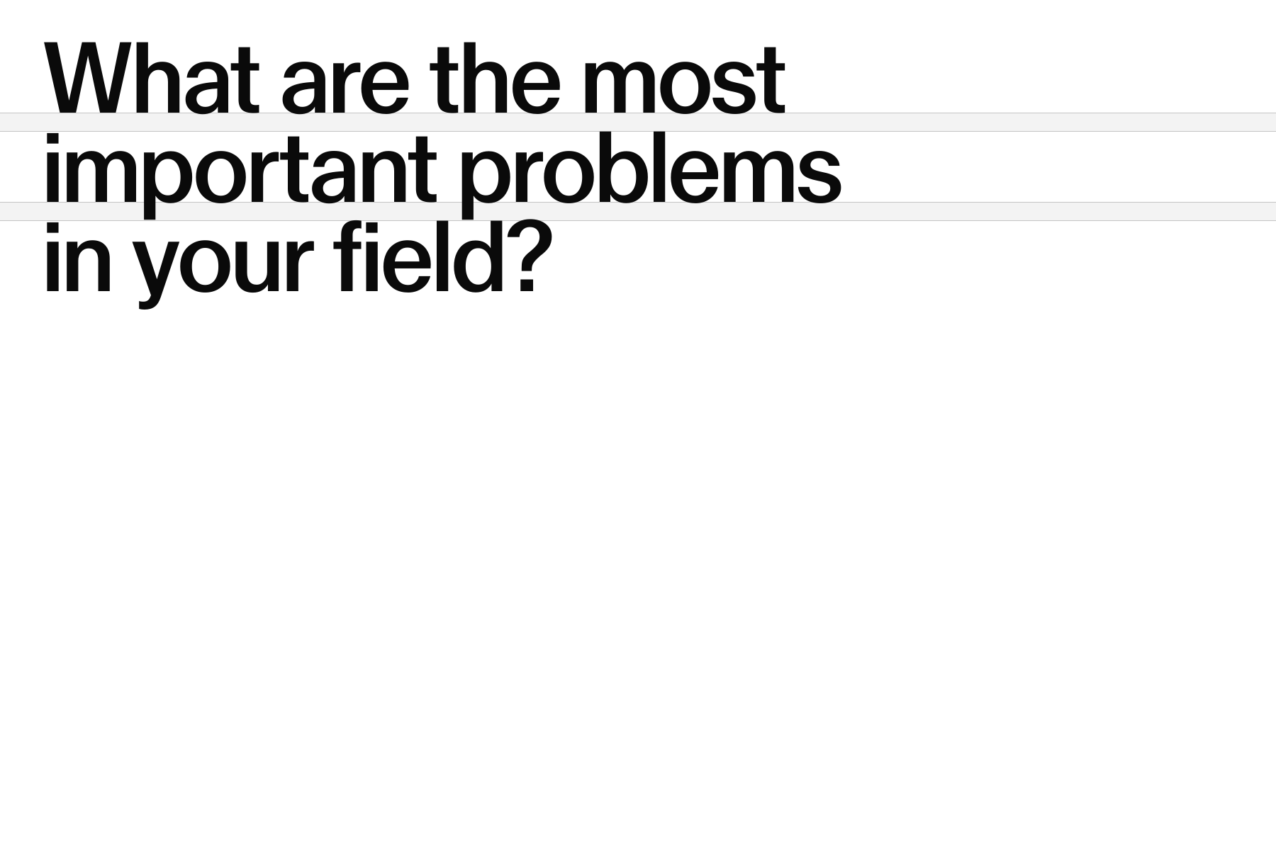
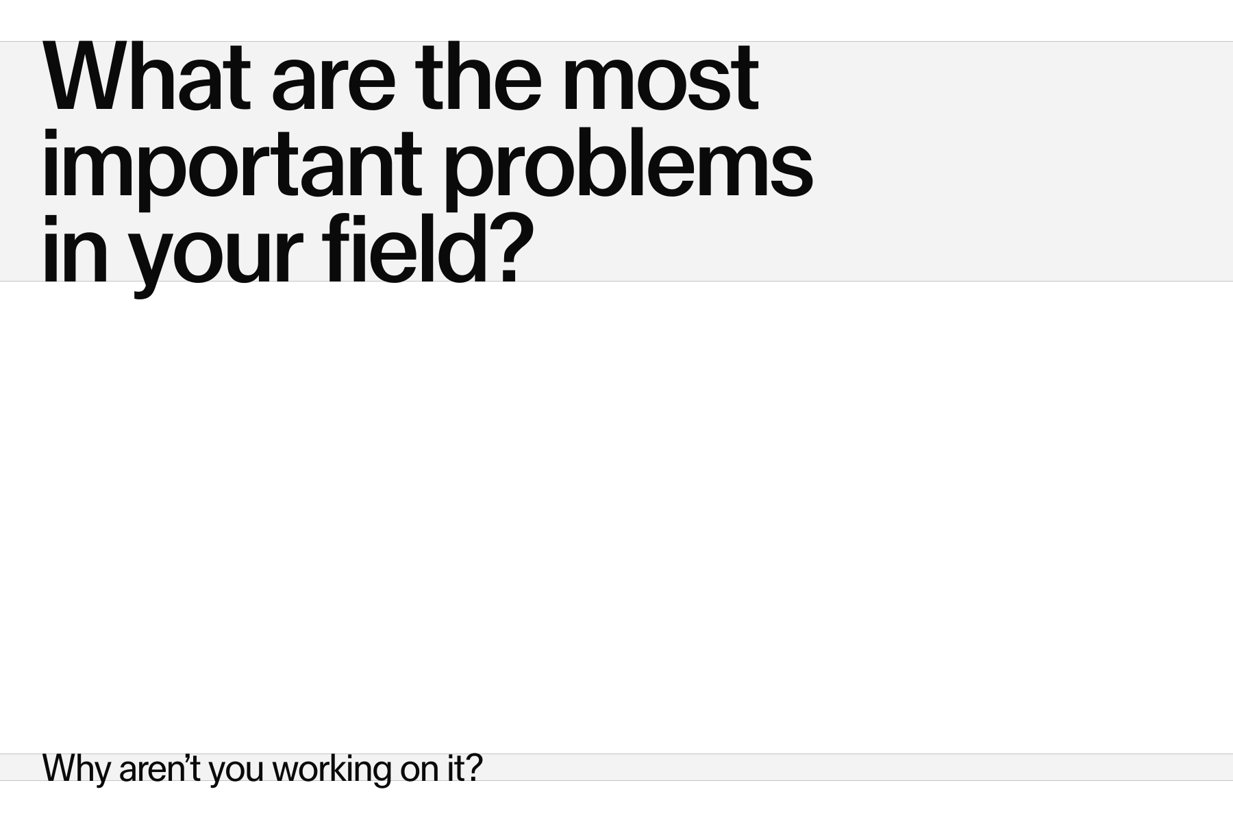
Tracking should be adjusted to the role and size of the type. Larger type benefits from tighter tracking, while smaller text should remain more open for readability.
Leading follows the same principle. Smaller text requires more space between lines, while larger type can be set tighter.
Keep hierarchy simple and use as few type sizes as possible. Create clear distinction through contrast in scale rather than introducing unnecessary sizes.
Type principles
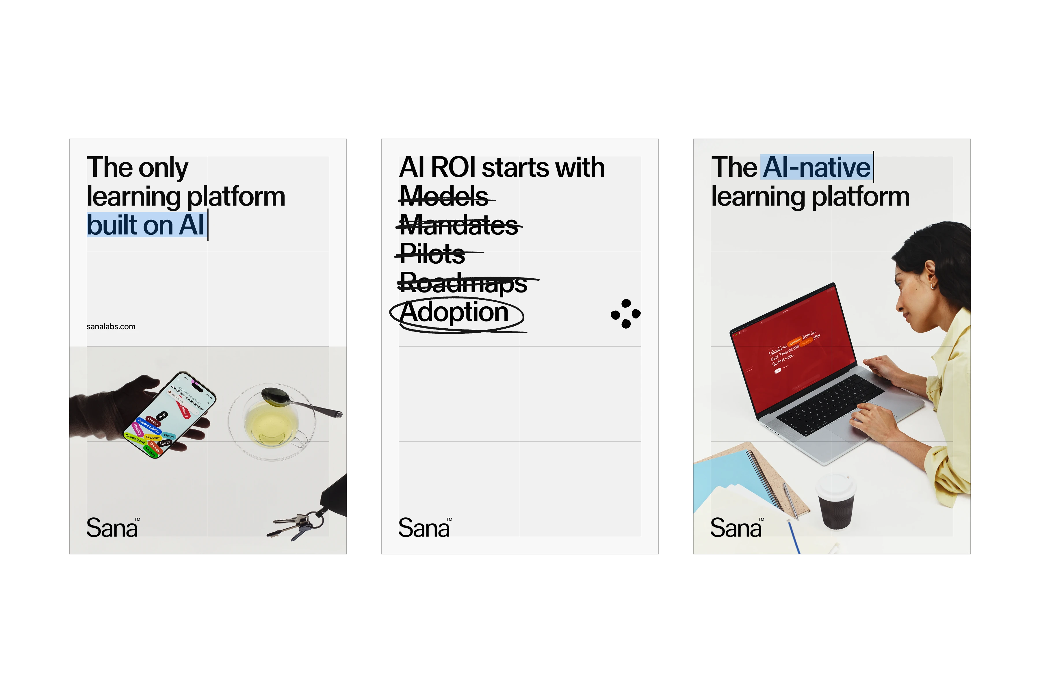
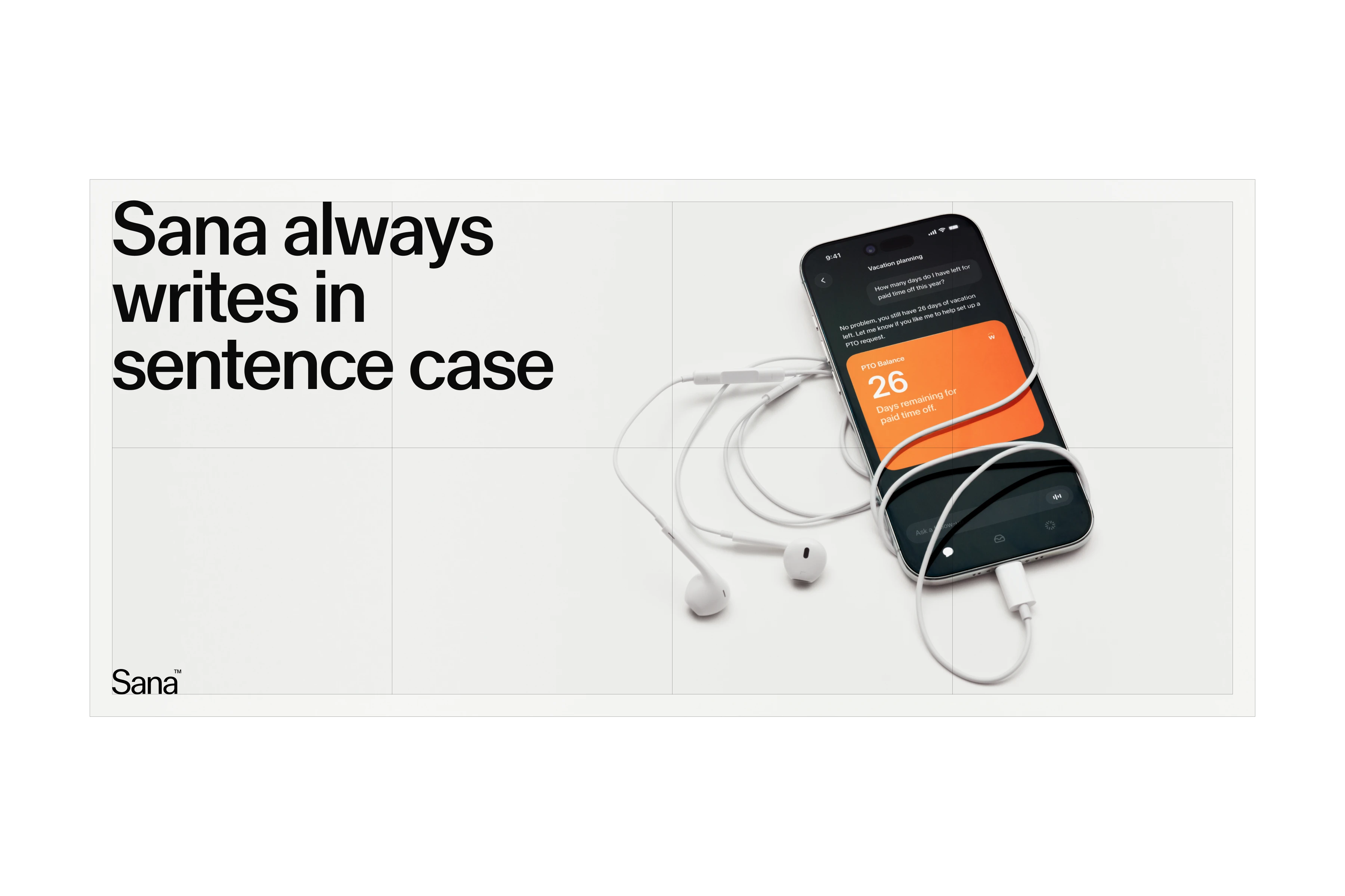
Always base a composition on a grid to create order, structure, and consistency across applications.
Use whitespace generously to give type and other elements room to breathe. Avoid crowding the edges of a composition or placing elements unnecessarily close together.
Always write in sentence case. Avoid title case or unnecessary capitalization to keep communication clear and consistent.

Usage examples
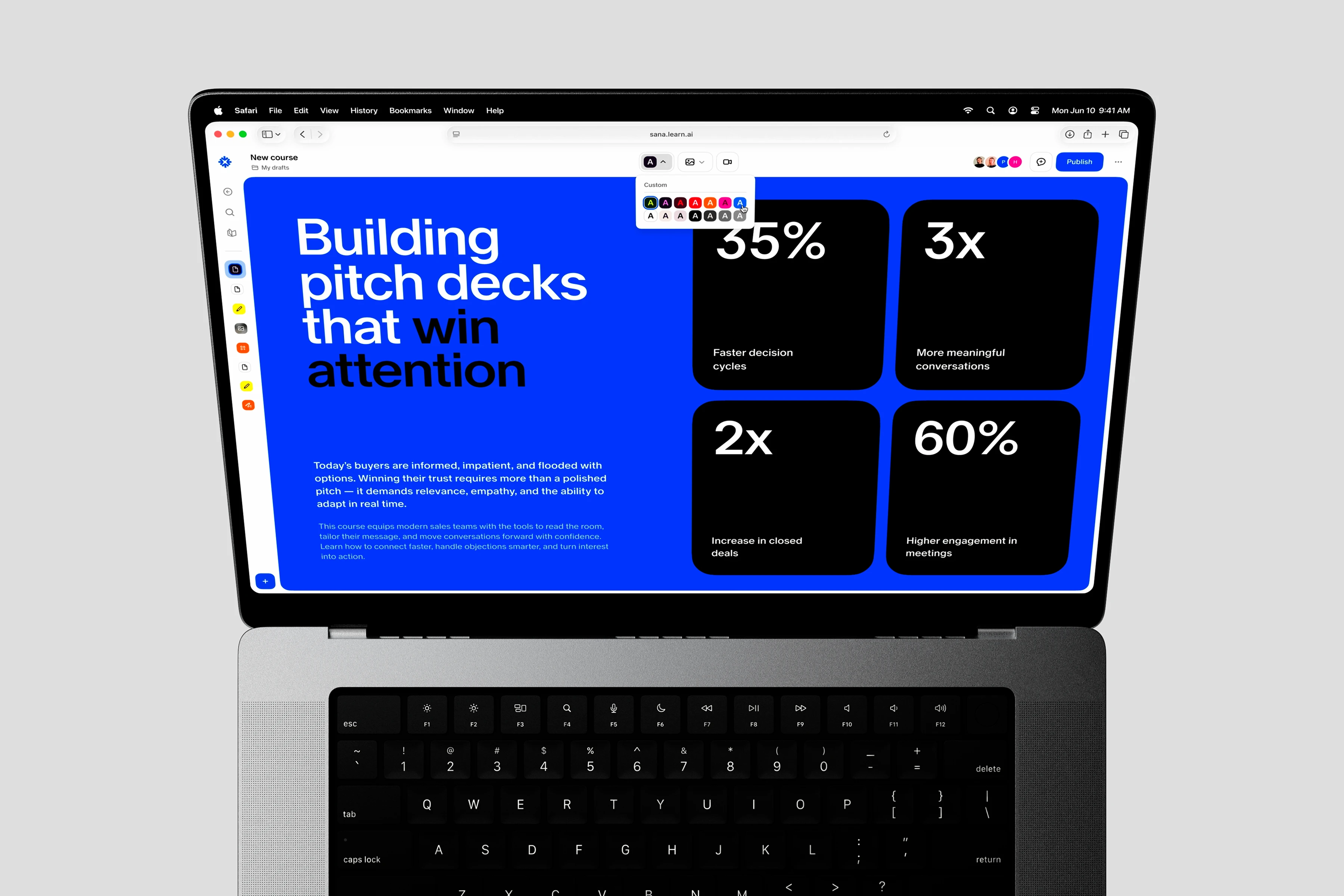
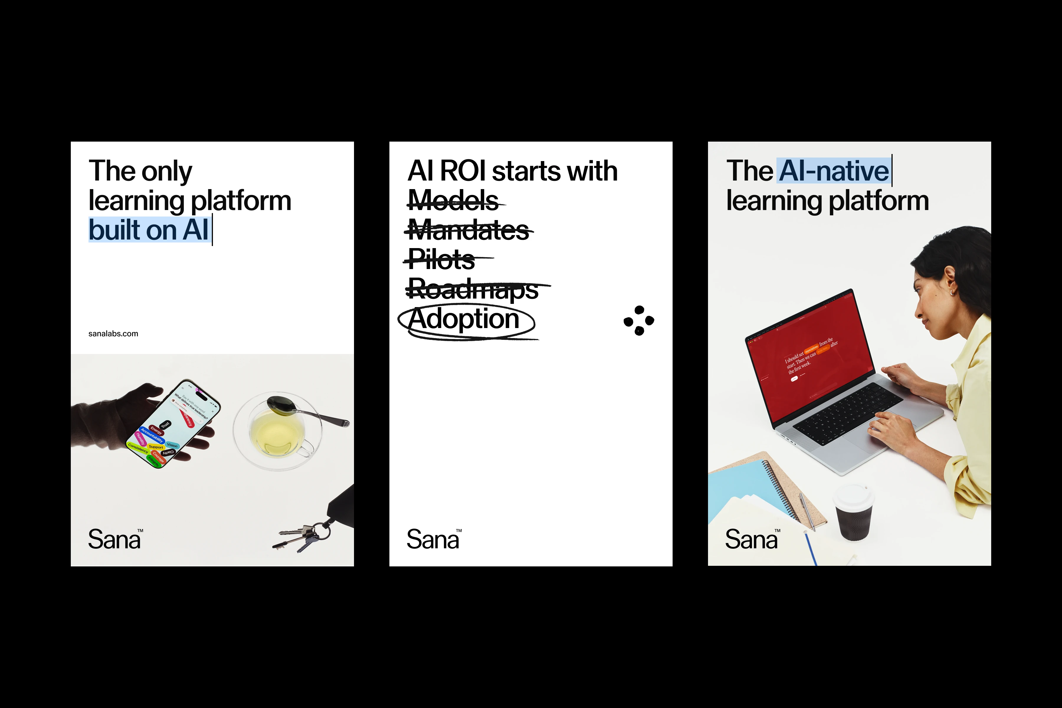
The examples show how typography is applied across typical applications, following the defined typographic principles.
Typical applications include:
- Presentation
- Ads
- Printed matter
- In product


Fallback
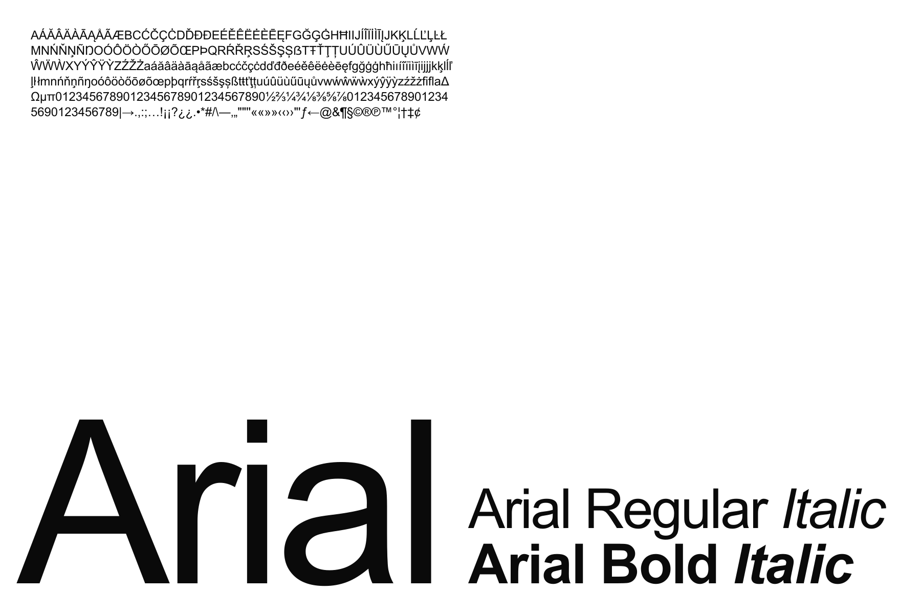
When Sana Sans is unavailable, use Arial as the fallback typeface. As a widely available system font, it ensures consistency and readability across applications.