- Read more
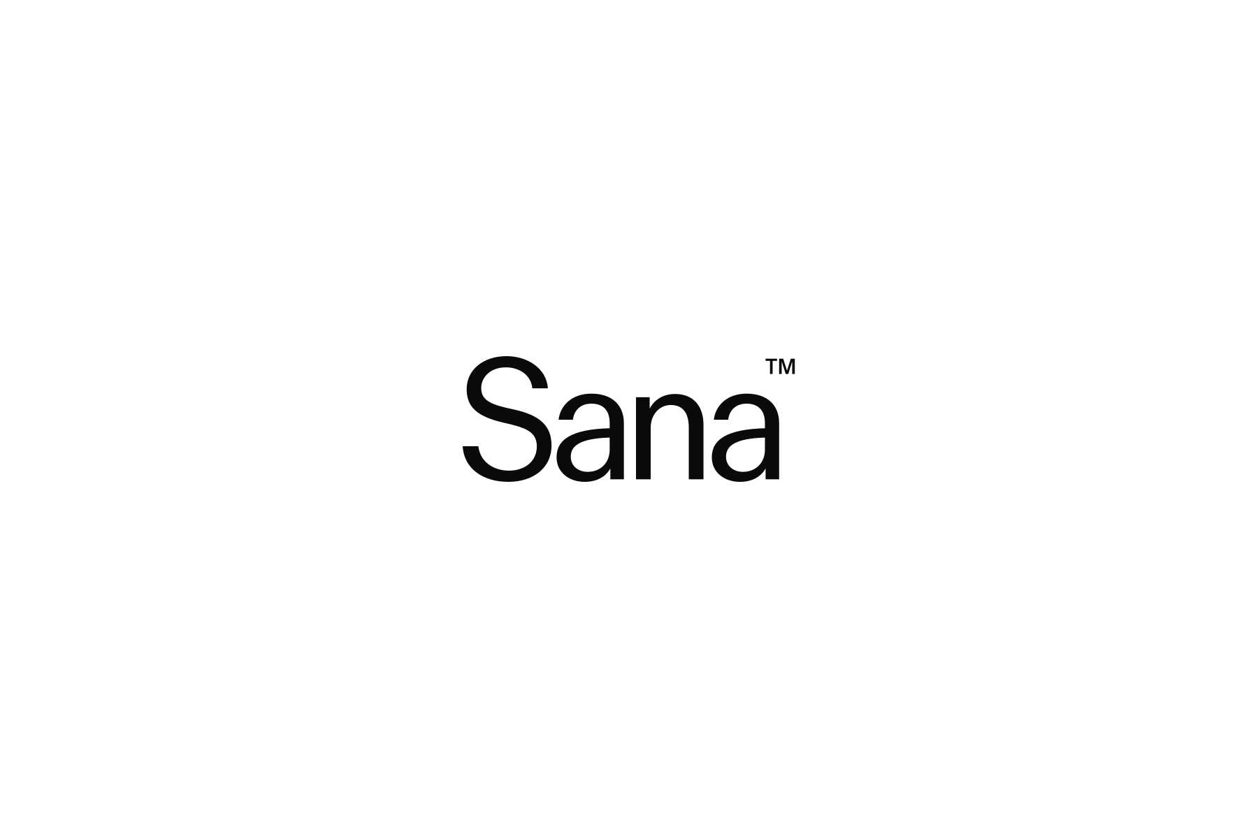
Logotype
The Sana logotype consists of two separate elements. They operate independently rather than as a fixed lockup – the wordmark carries our identity in most contexts, the symbol is reserved for product interfaces or spaces too small to accommodate the wordmark.
- Read more
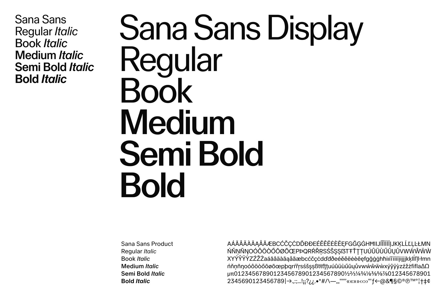
Typography
Typography is one of the most powerful tools we have for communicating who we are. With a diverse family of weights and styles, Sana Sans flexes across every touchpoint – from the smallest product detail to the boldest headline.
- Read more
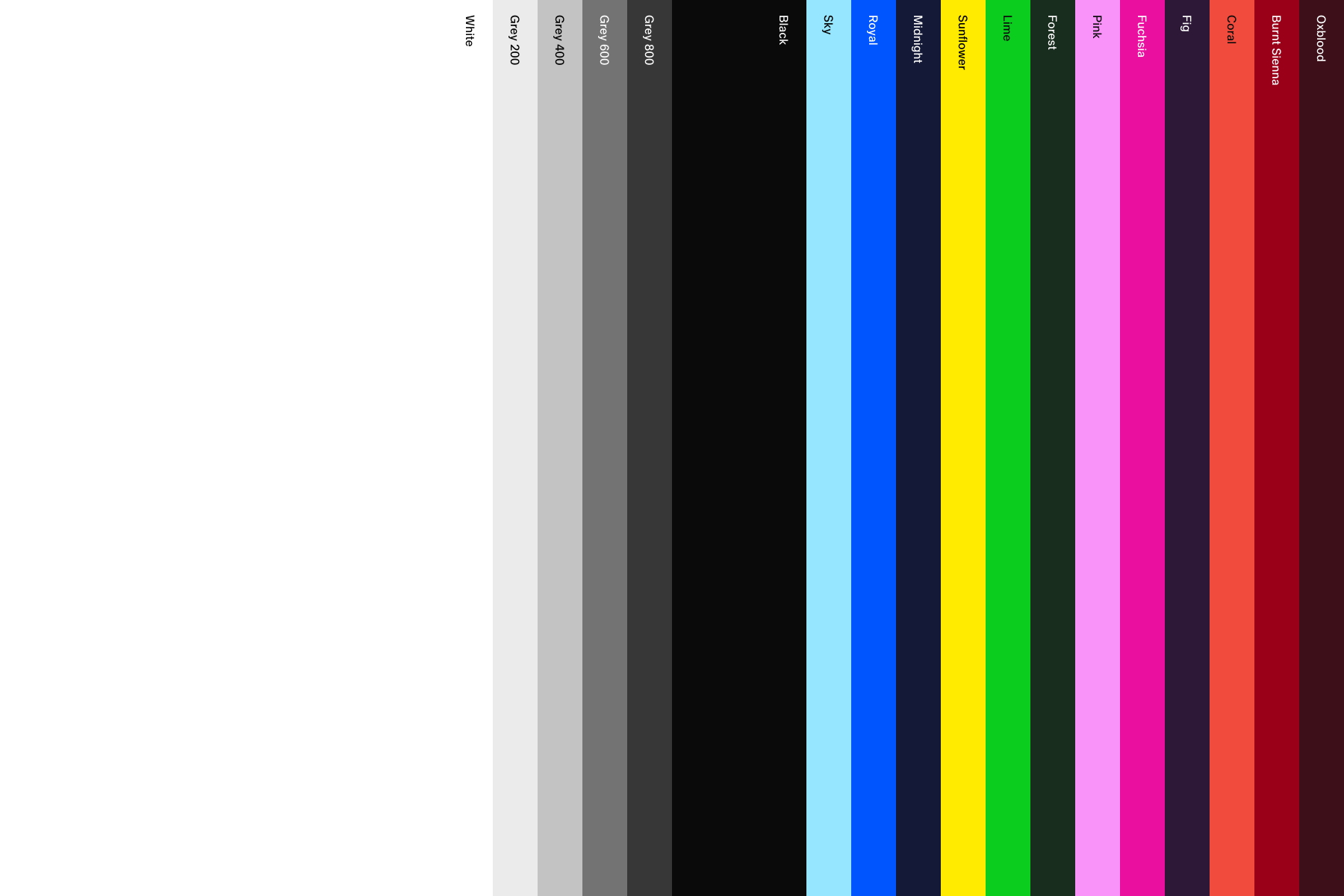
Color
Color plays a defining role in how Sana looks and feels. From a monochromatic foundation to a set of more expressive tones, this palette gives us the range to balance clarity and personality.
- Read more
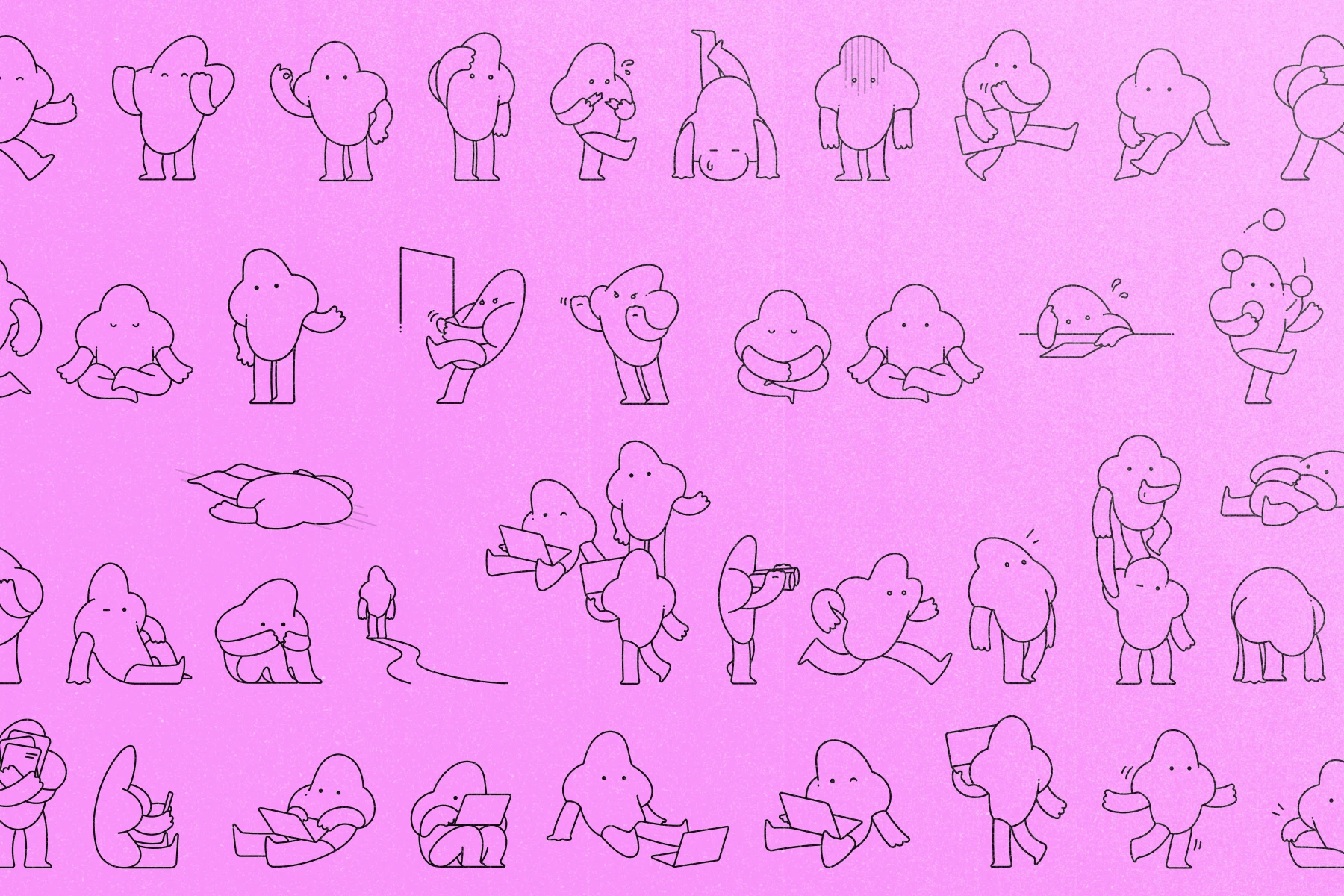
Illustration
Illustration gives Sana a way to explain what imagery can't. It brings dynamism to our work and clarity to complex, abstract subjects. It should be used thoughtfully and with care, chosen where it adds clarity rather than as a default or decorative choice.
- Read more
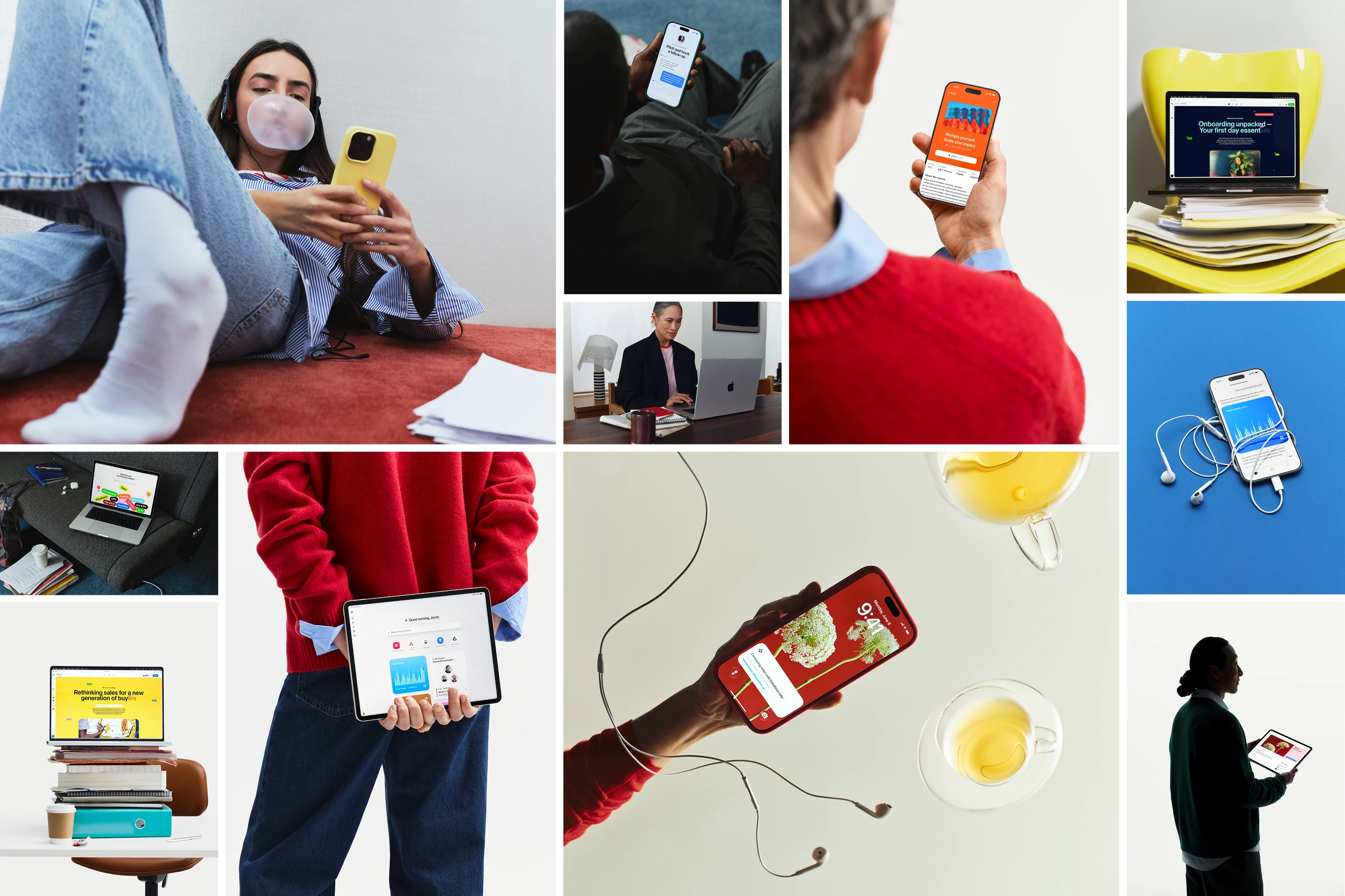
Imagery
Imagery brings Sana to life – our product, our people, and the moments in between. It adds warmth and authenticity other elements can't. Our library evolves continuously, with new shoots as the product grows.
- Read more
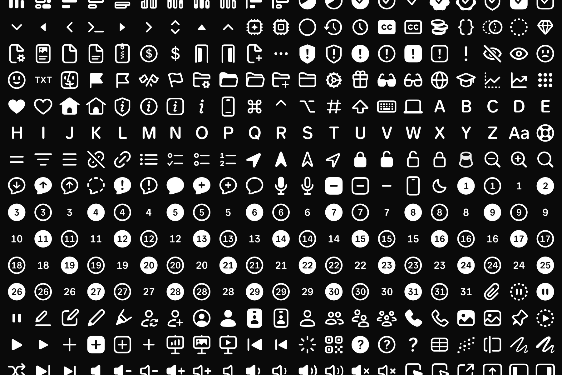
Iconography
Iconography gives Sana a functional visual language, used to guide and clarify within our product. It reduces complexity into simple, recognisable marks, prioritising clarity over decoration.
- Read more
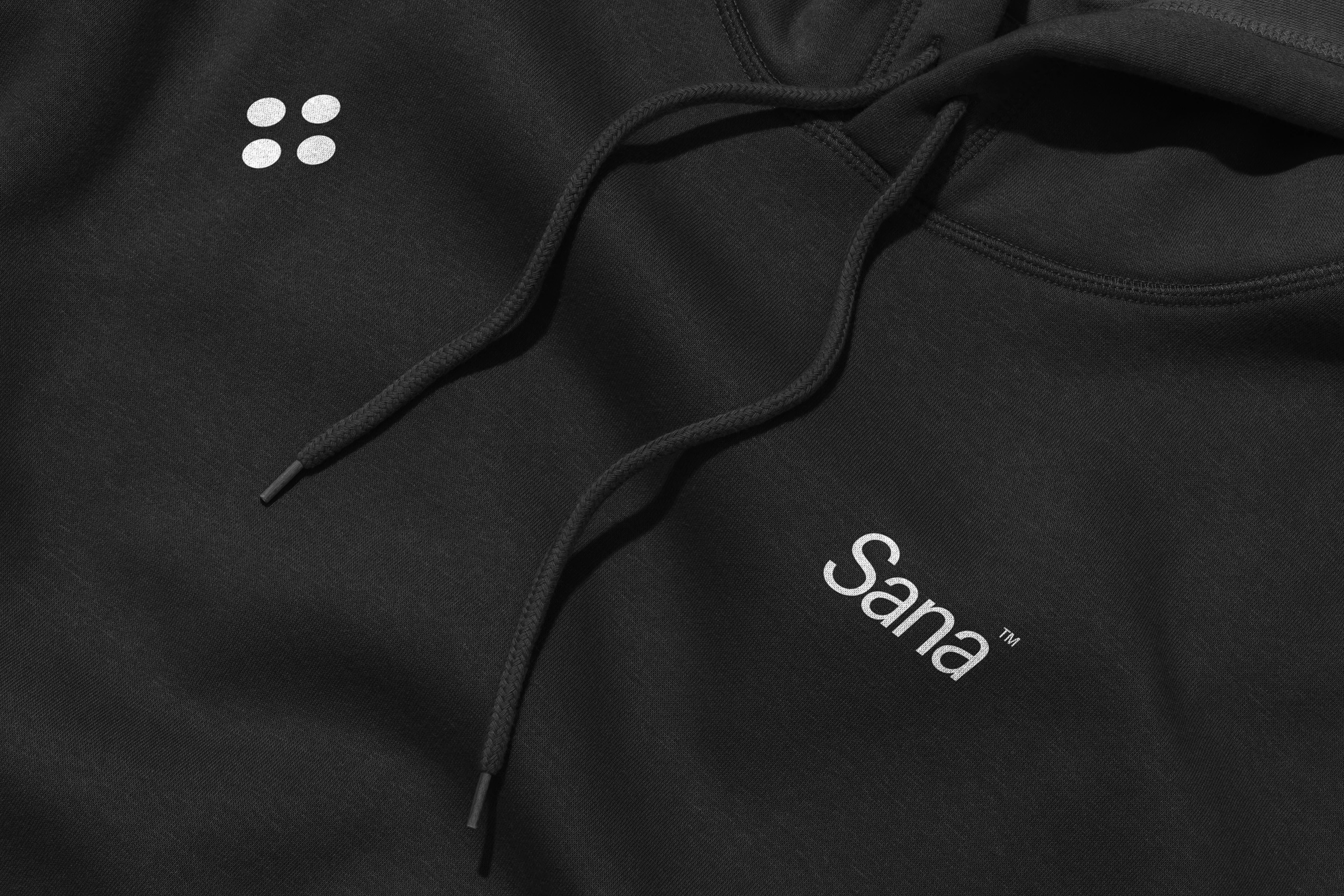
Resources
Resources brings together supporting materials that extend beyond our core brand elements. Here you'll find downloads for a range of uses across the brand.
Welcome to the Sana brand portal. Here you’ll find all the assets you need to create consistent communications and representations of our brand.