Wordmark
Our wordmark is the most distilled expression of the Sana identity and the primary carrier of our brand. It is set in our custom typeface, Sana Sans, designed for clarity, warmth, and precision. Consistent use of our wordmark ensures a strong and recognisable identity.
- Wordmark
Downloads
Wordmark clearspace
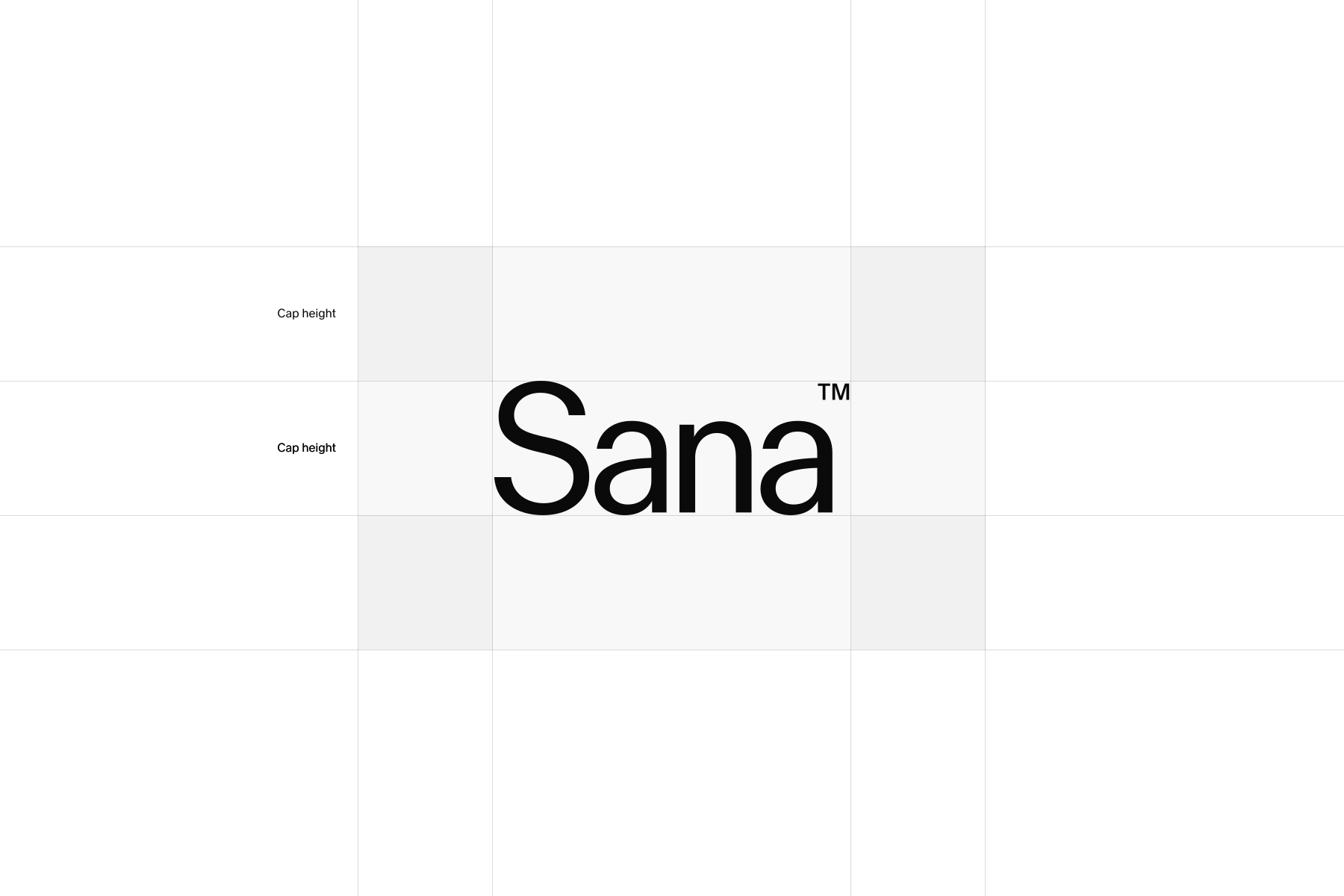
The wordmark is most effective when surrounded by generous clear space.
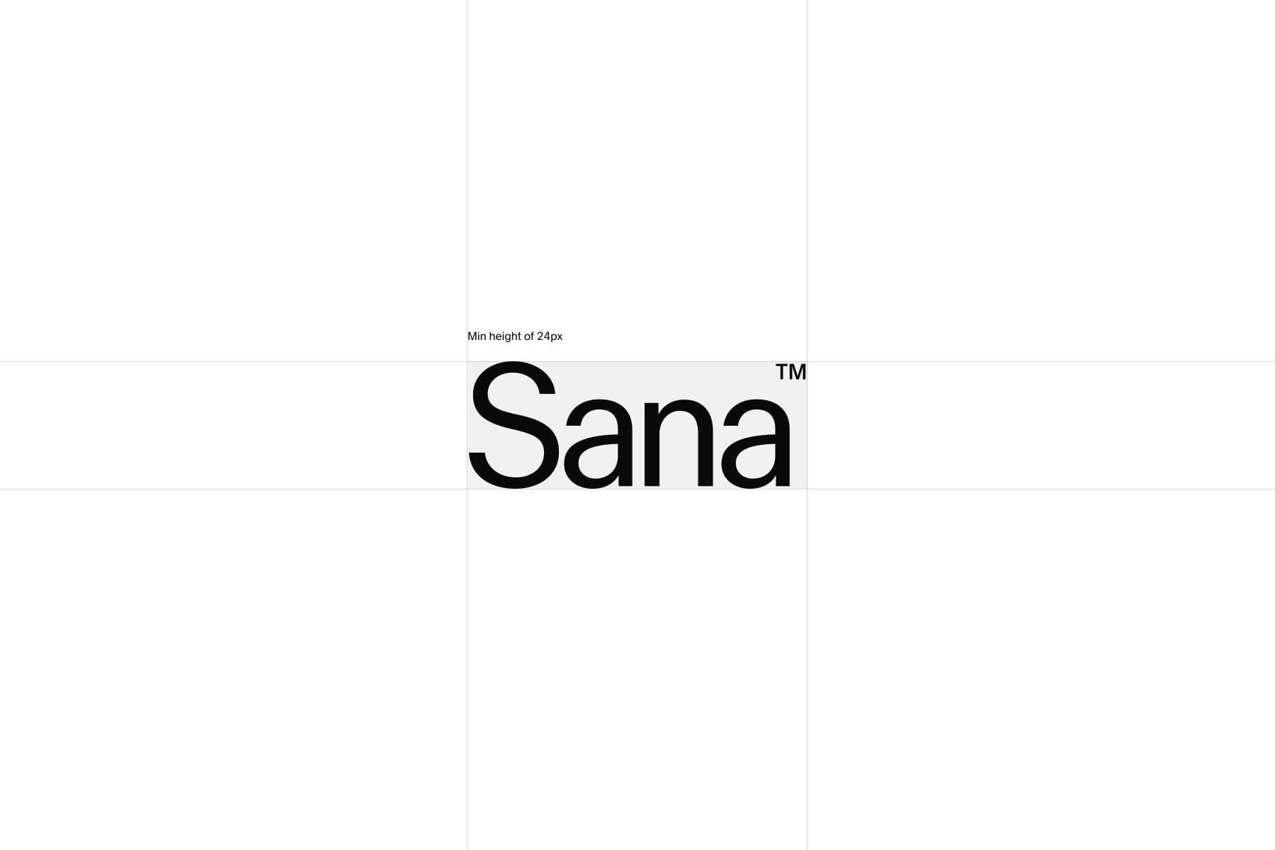
The minimum clear space around the Sana wordmark is equal to the height of the wordmark and should be maintained in all applications.
Clear space refers specifically to the area around the wordmark that must remain free of graphic elements, text, or imagery. It is separate from page margins or general layout padding.
Wordmark placement
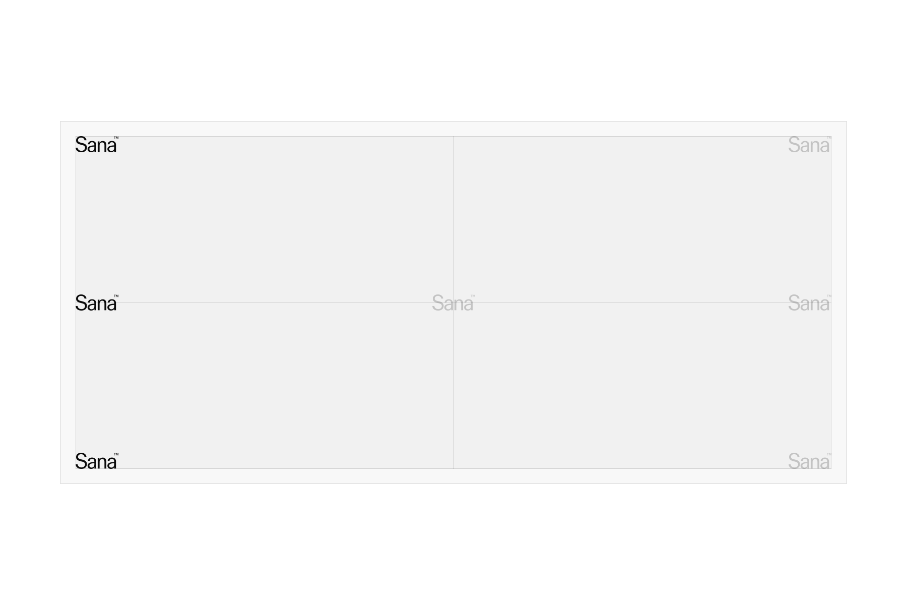
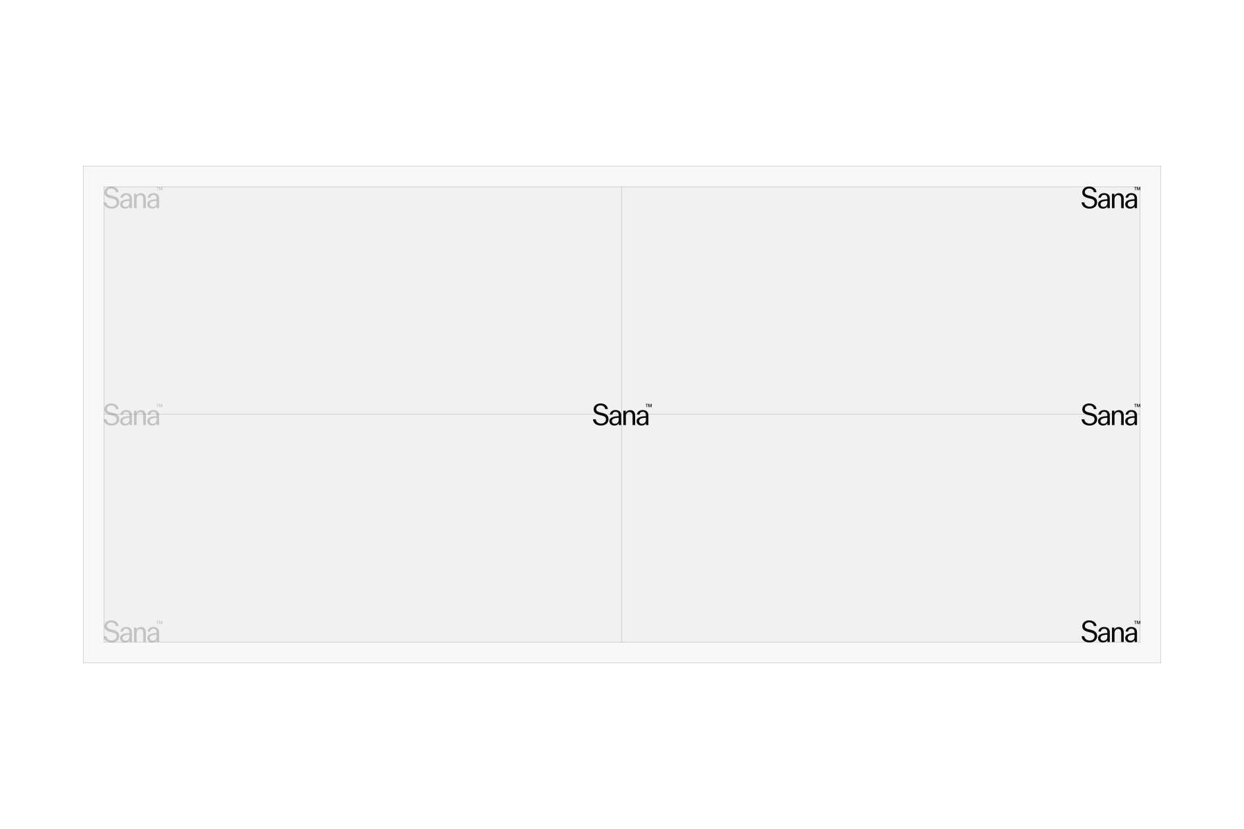
The left side is the primary placement for our wordmark across all formats. It may sit in the top or bottom corner, or vertically along the left margin.
The right side and center are secondary placements, used when the primary position is not suitable–for example, when other elements occupy the left side or in specific event applications such as lightboxes.
Wordmark sizing
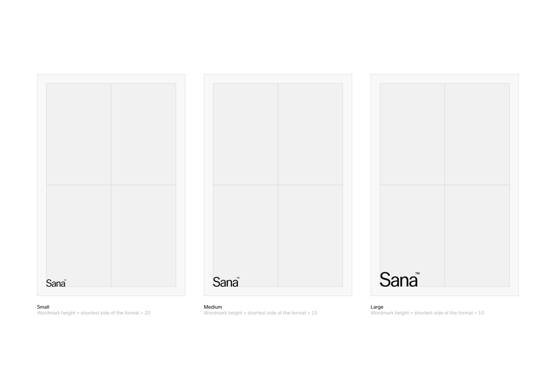
The wordmark can be sized relative to the format. As a general guideline, divide the shortest side by 20, 15, or 10, depending on the desired prominence. For example, 1080 px ÷ 15 gives a wordmark height of 72 px.
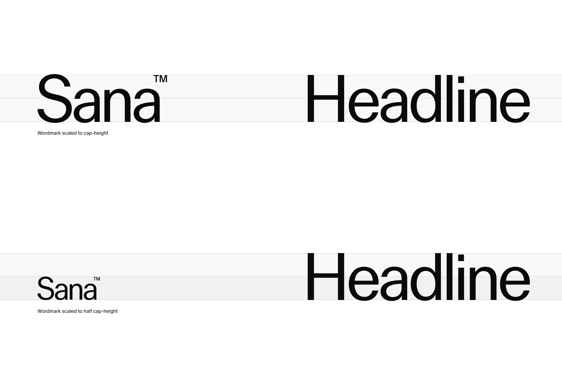
When paired with typography, use the cap height as a guide. The wordmark can match the cap height or be scaled to half its height, depending on the composition.
For digital applications, the minimum wordmark height is 24 px.
Symbol
Our symbol plays a secondary role within the identity, acting as a signature element used sparingly to complement the wordmark. When applied with care, it reinforces recognition and adds distinction without competing with the primary brand carrier.
The animated version, Sana Loader, is available as MP4 and Lottie (.json).
- Symbol
- Symbol animation
Downloads

Symbol clearspace
The symbol is most effective when surrounded by generous clear space, supporting our minimal and focused design language.
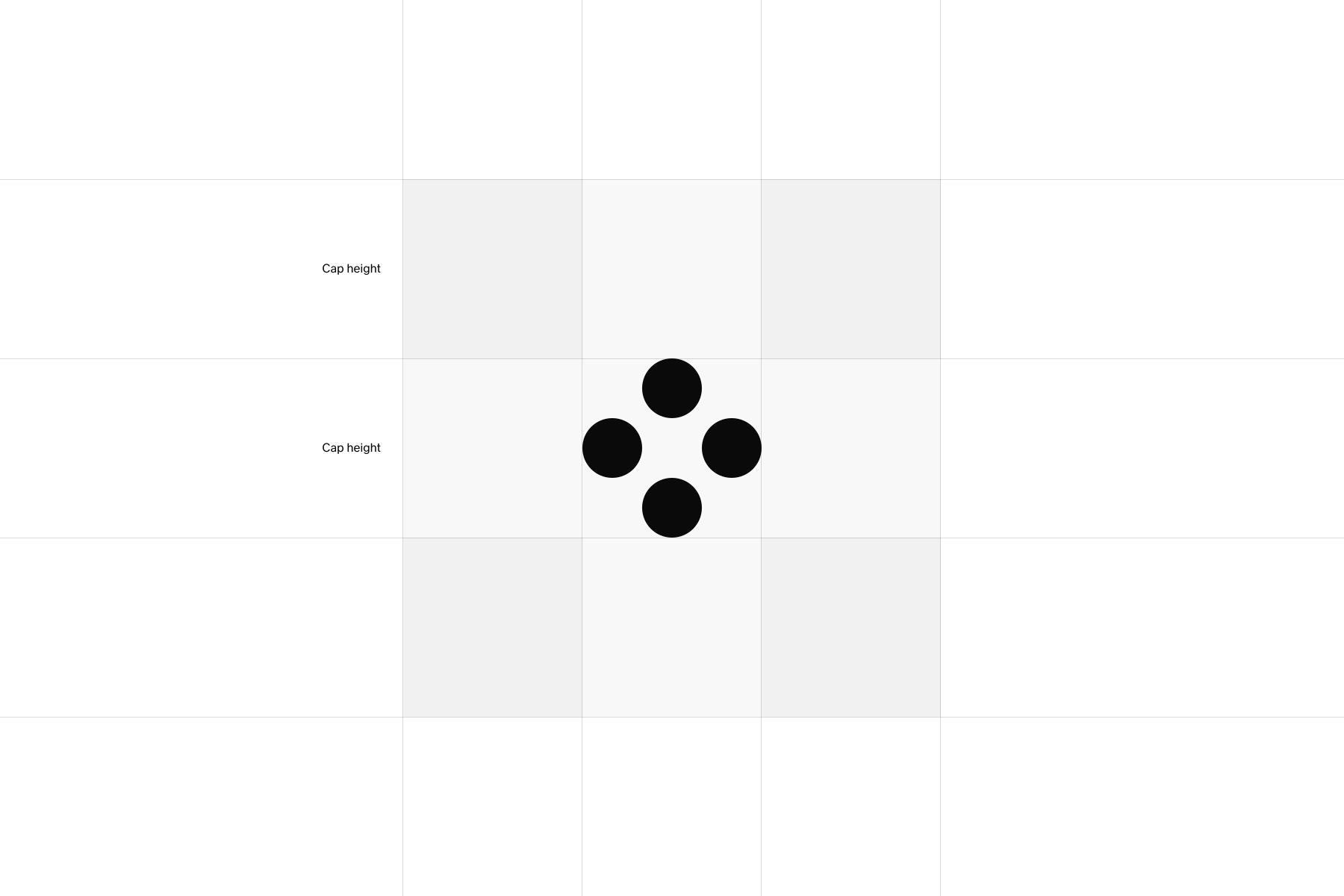
The minimum clear space around the Sana symbol is equal to its height and should be maintained in all applications.
Clear space refers specifically to the area around the symbol that must remain free of graphic elements, text, or imagery. It is separate from page margins or general layout padding.
Symbol placement
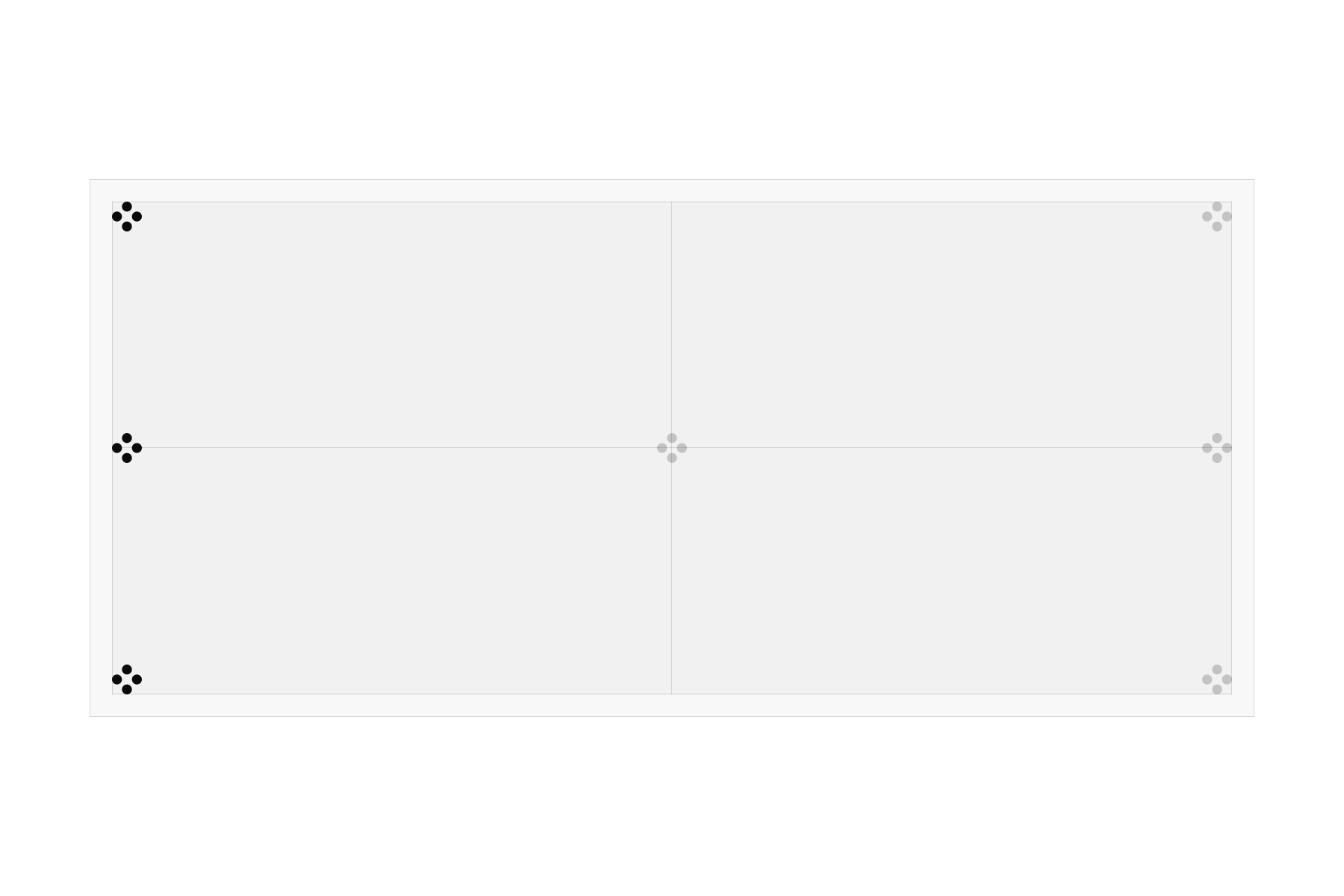
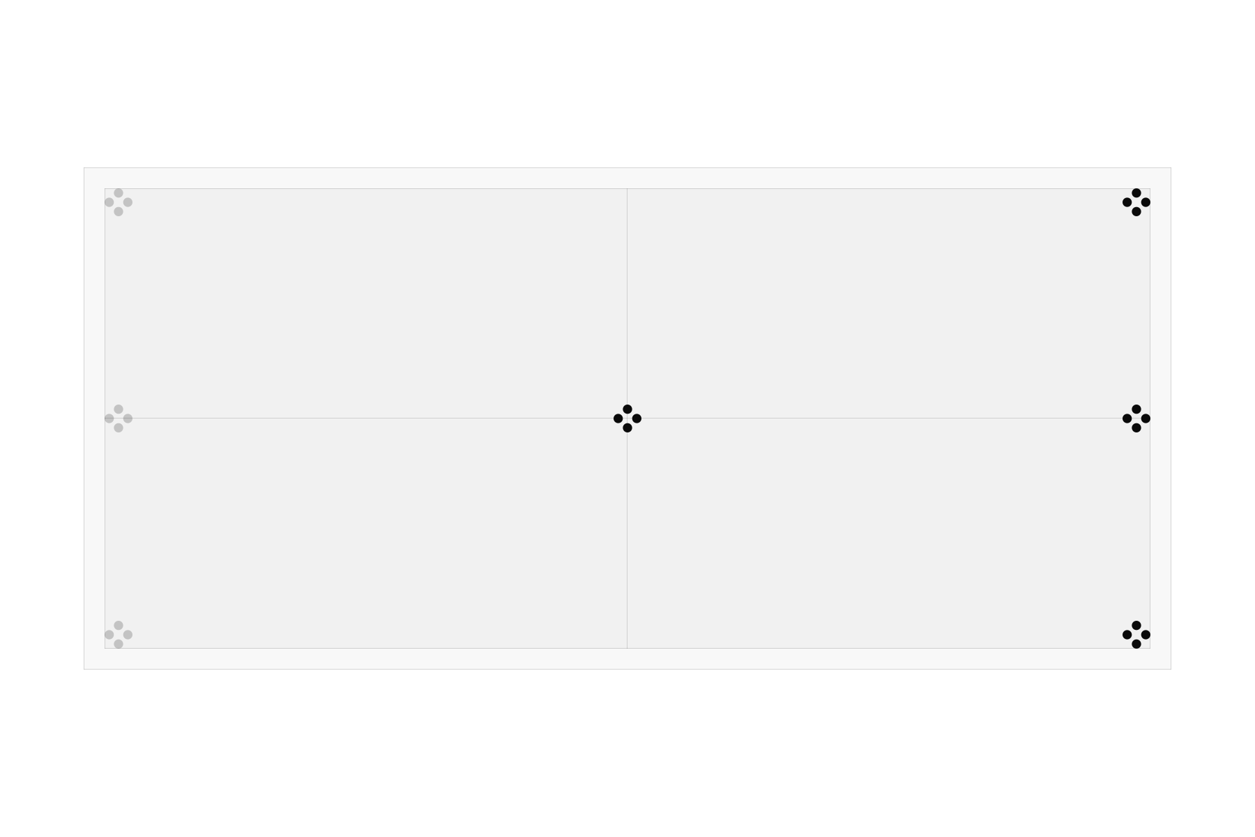
The left side is the primary placement for our symbol across all formats. It may sit in the top or bottom corner, or vertically along the left margin.
The right side and center are secondary placements, used when the primary position is not suitable–for example, when other elements occupy the left side or in specific event applications such as lightboxes.
Symbol favicon and avatars
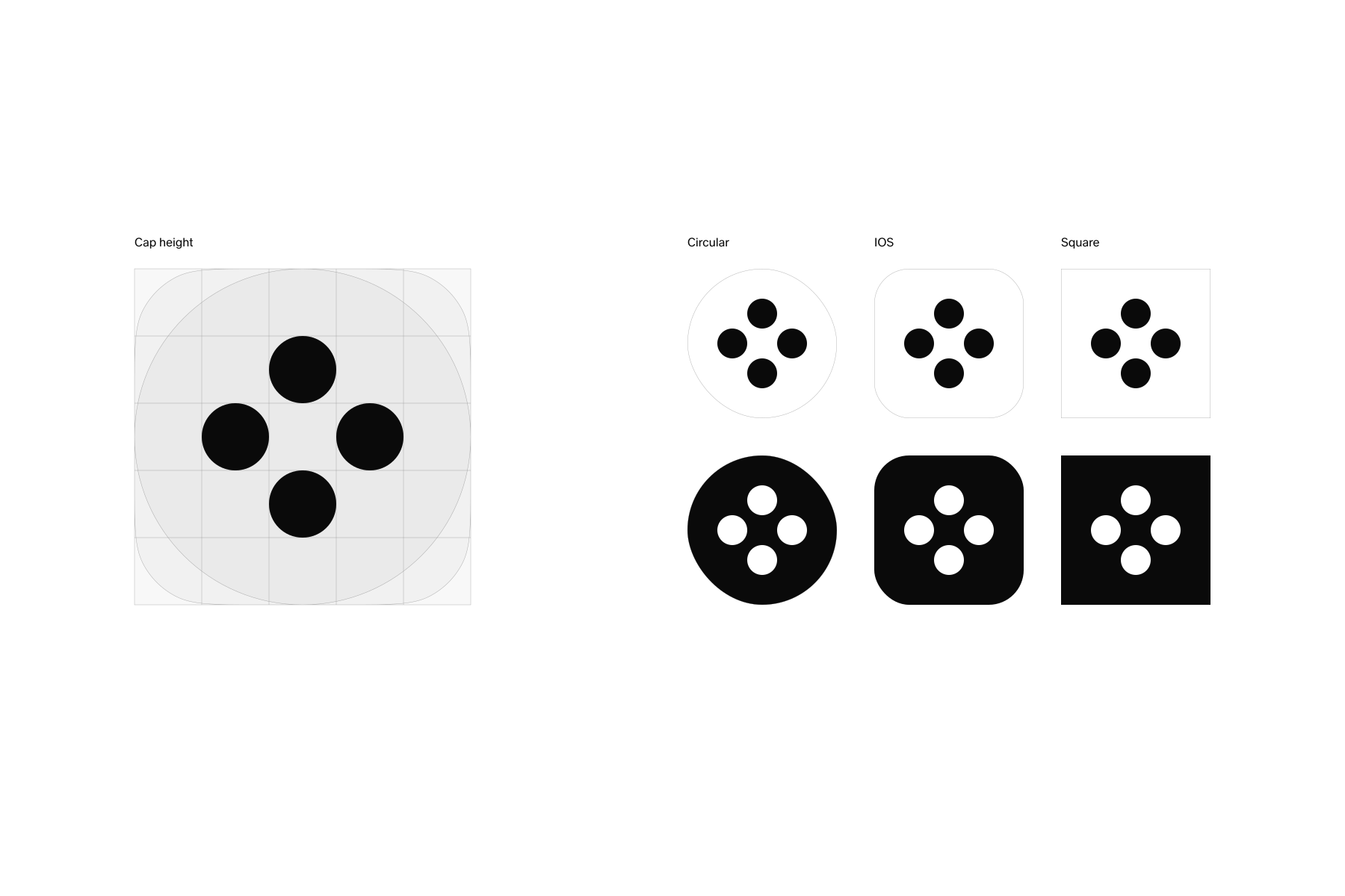
In digital applications such as avatars and profile images, use the Sana symbol.
The symbol should be scaled to 6/10 of the format, with backgrounds limited to black or white.
- Favicon
Downloads
A Workday company
The ‘a Workday company’ lock-up signals Sana’s relationship to Workday while keeping Sana as the primary brand.
It is reserved for applications where Workday ownership needs to be communicated and should be used with restrained scale and placement, without competing with the core Sana message or visuals.
- A Workday company lockup
Downloads
A Workday company sizing
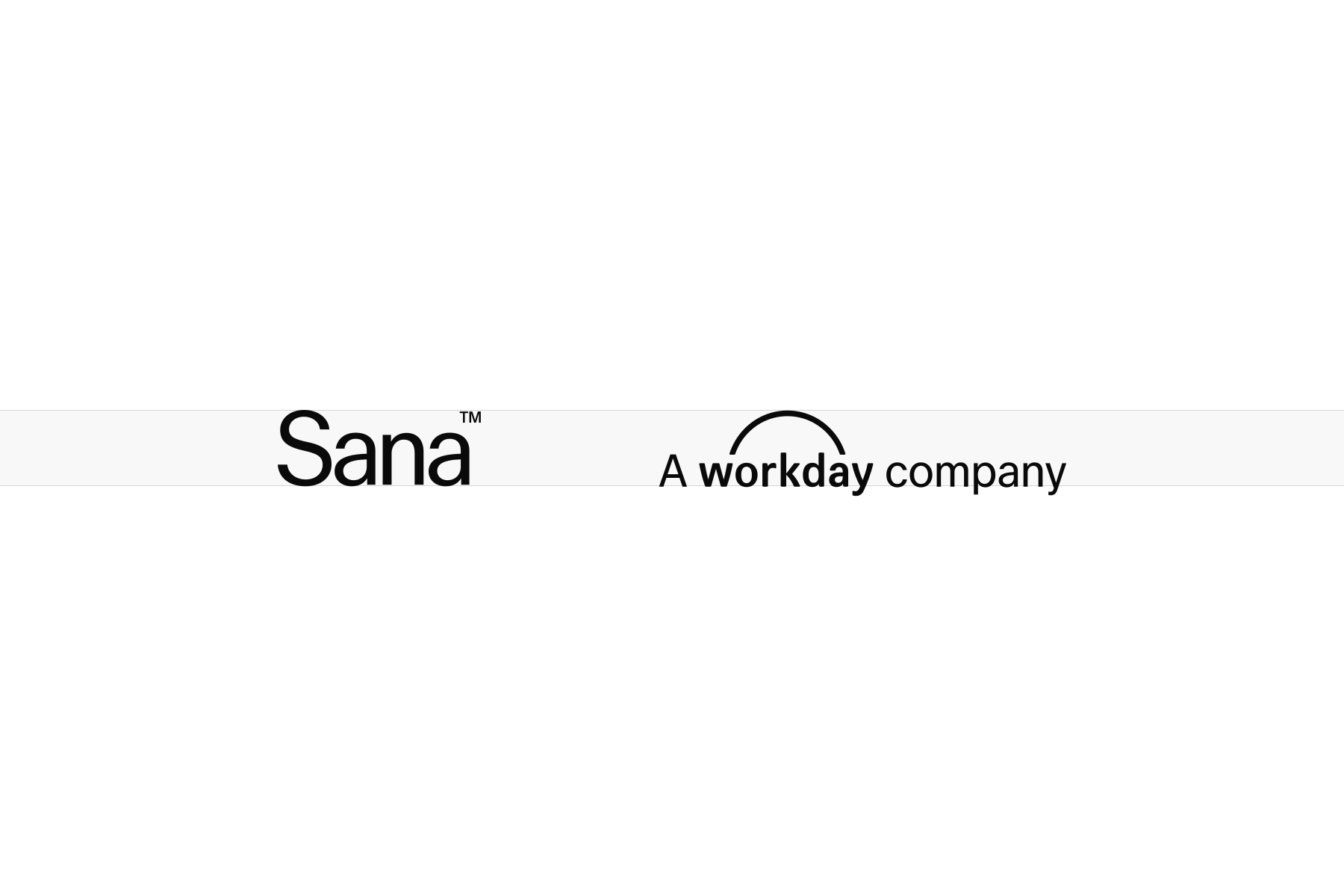
The height of the lock-up must never exceed the height of the Sana wordmark. It should always remain visually secondary, maintaining a clear hierarchy between the Sana brand and the Workday endorsement.
A Workday company placement
The wordmark and lock-up should always be aligned to maintain a consistent visual relationship across applications.
Vertical alignment places the lock-up in line with the wordmark along a shared vertical axis.
Horizontal alignment places the lock-up in line with the wordmark along a shared horizontal axis.
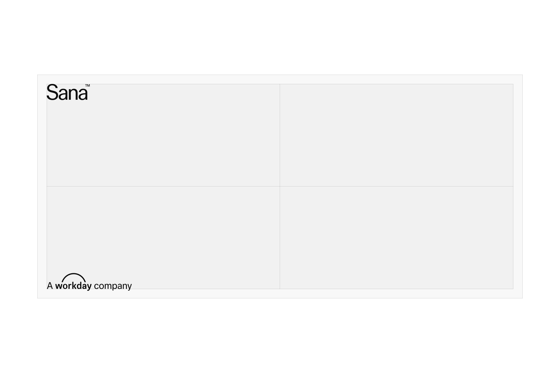
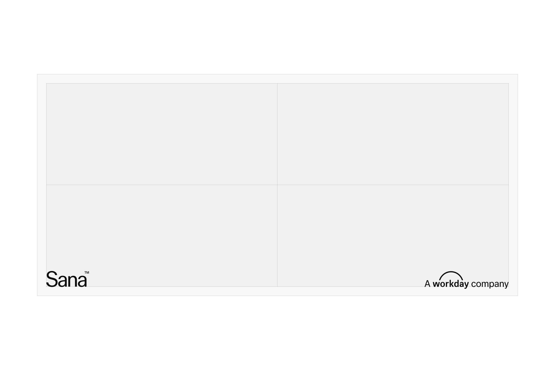
A Workday company usage examples
The examples show how the lock-up is applied across typical applications, following the defined sizing and placement principles while maintaining a clear hierarchy between Sana and the Workday endorsement.
Typical applications include:
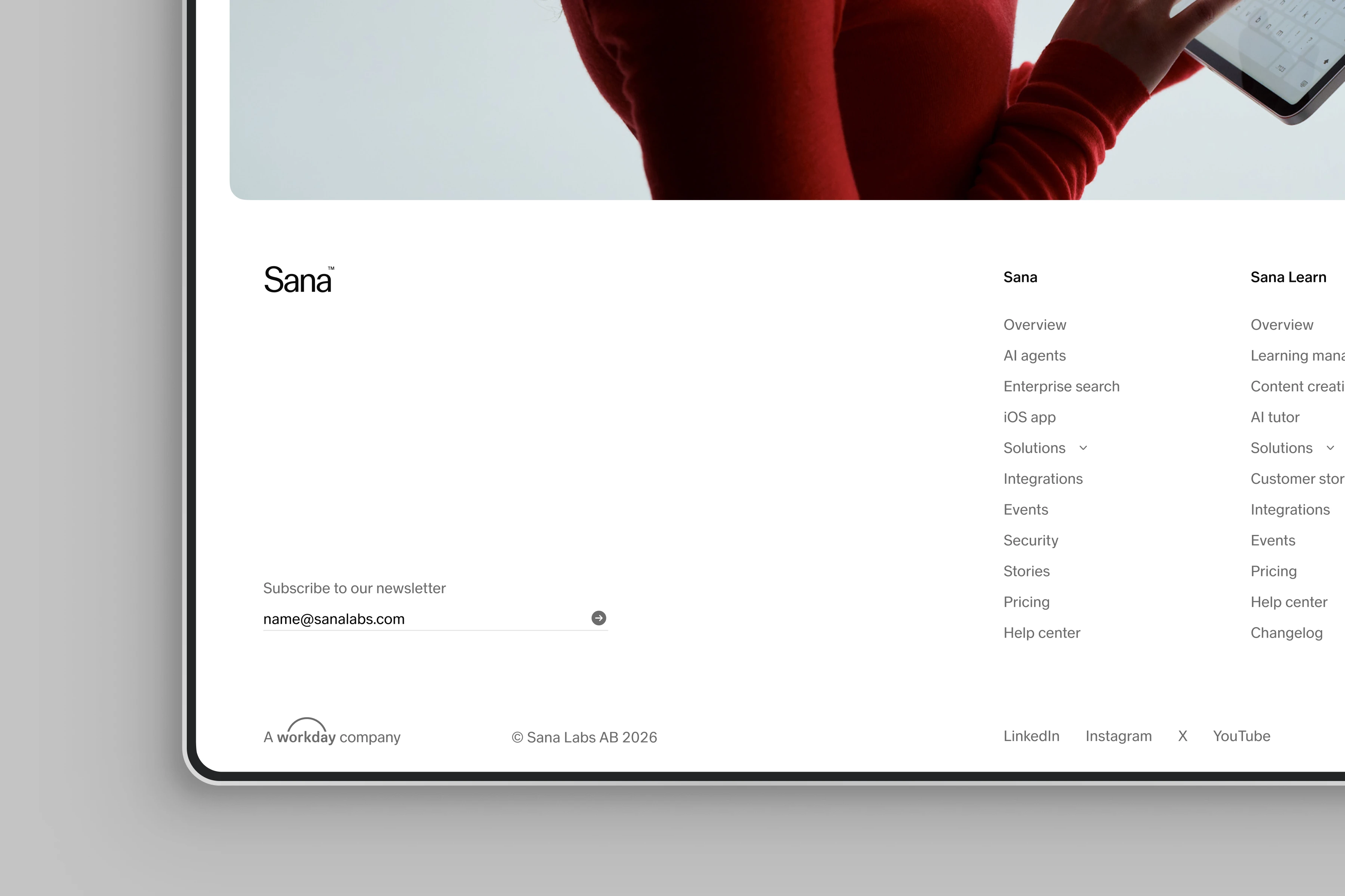
- Website footers
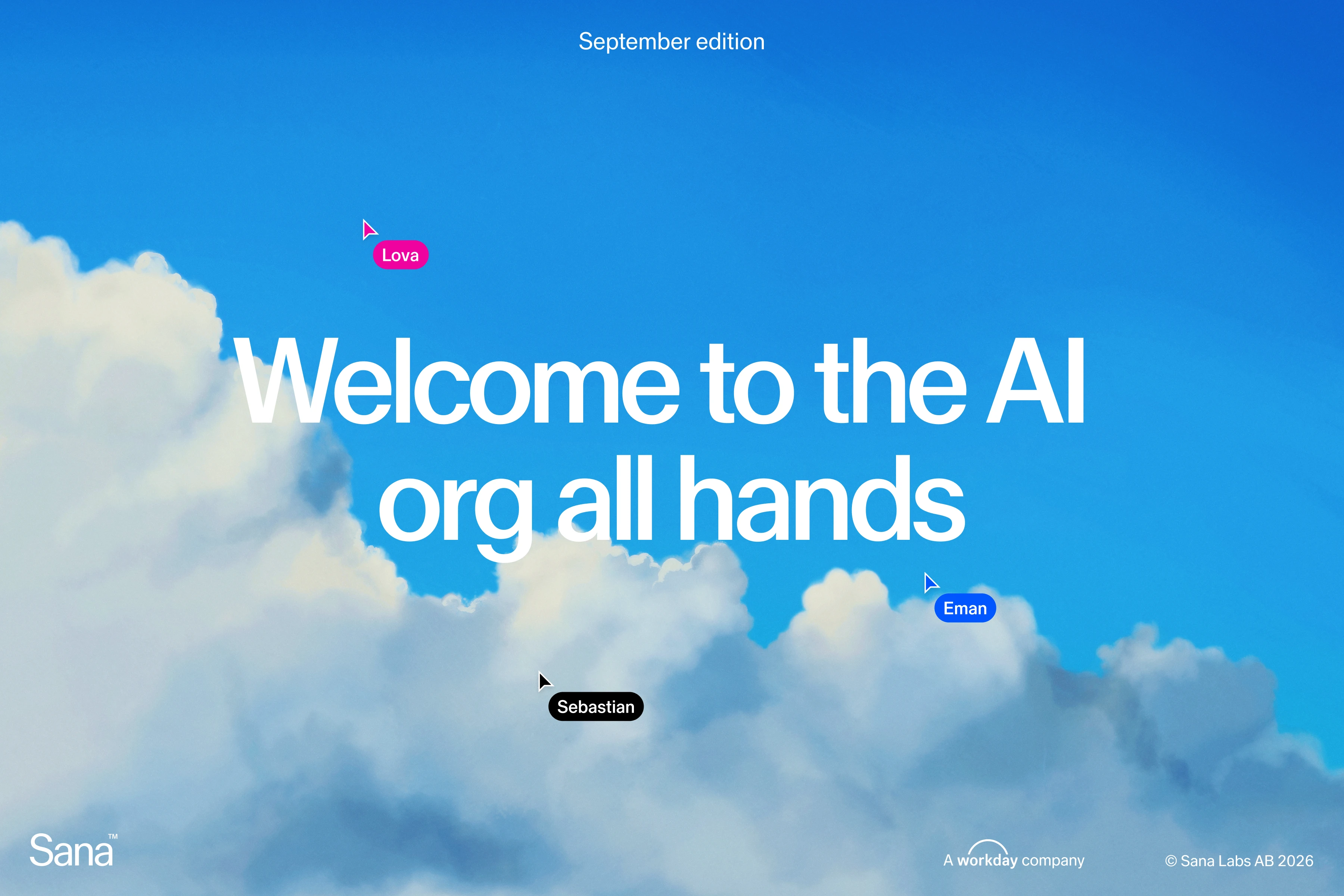
- Presentation covers and closing slides
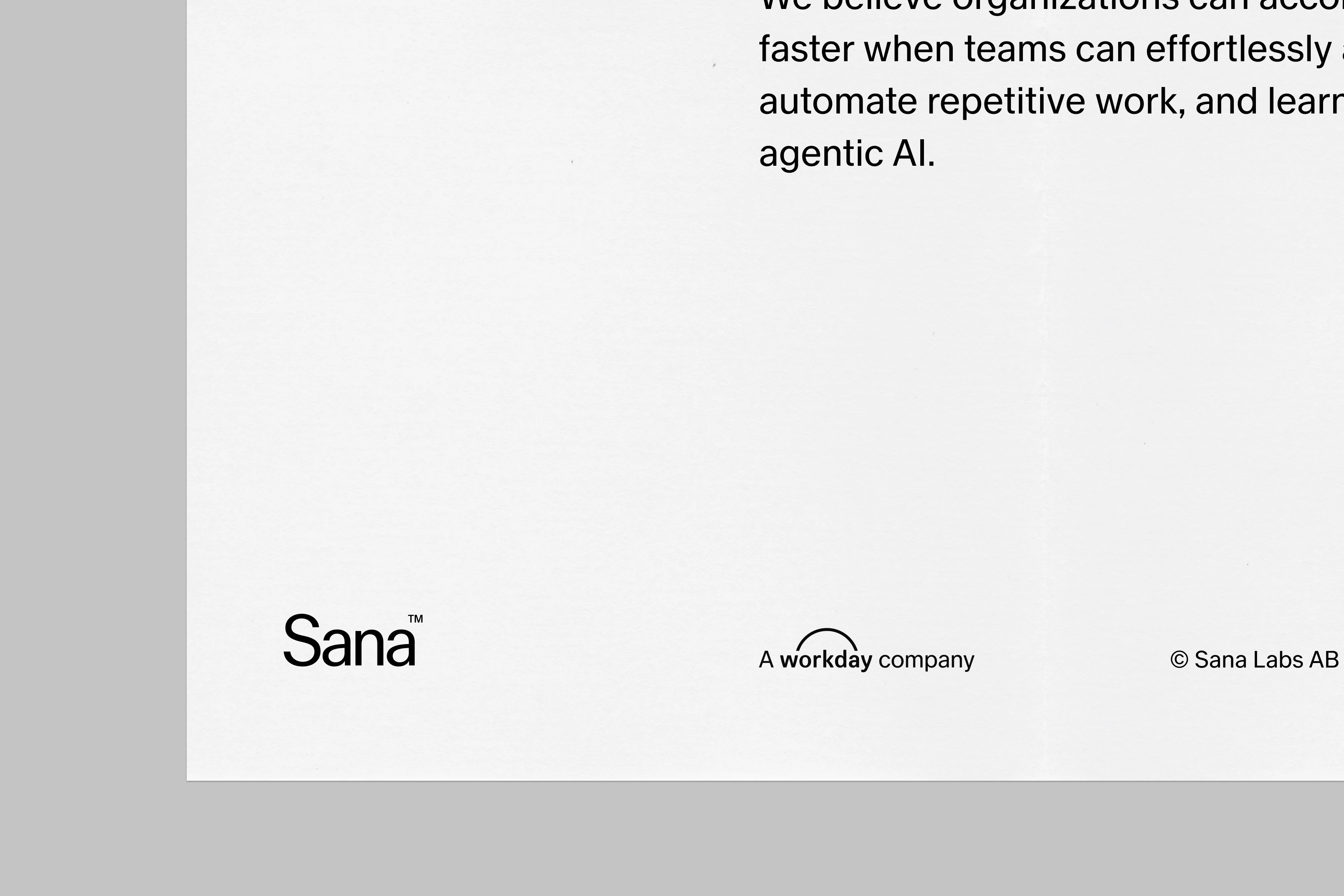
- Legal documents, collateral and reports